Discover Albania
Manual përdorimi për Distributorët e Platformës Discover.
Manuali nga A deri në Z rreth përdorimit të platformës.
- Versioni: 1.0
- Autori: discover.al - Team
- Created: 11 Janar, 2024
- Update: 11 Janar, 2024
Nëse keni ndonjë pyetje që kalon jashtë kufijve të këtij dosjes ndihmuese, ju lutem ndihuni të lirë të dërgoni një email përmes info@discover.al
Si të logohem në platformë?
Më poshtë ndiq hapat për të hyrë në faqen e Web:
- Marrim të dhënat e user-it nëpërmjet administratorit të faqes web psh: www.discoverxxxxxx.al (ose www.discoverxxxxxx.al pra sipas qytetit që ju jeni partner) duke shtuar prapashtesën /wp-admin -> www.discoverxxxxxx.al/wp-admin
- Elementet e faqes se log in
Word in English.- Kuptimi i cdo fjale.username :- Emri i perdoruesitpassword :- FjalëkalimRemember Me :- Do të thotë ruajtjen e informacioneve të hyrjes për përdoruesin për vizitat e ardhshme.Login in :- Do të thotë identifikim dhe hyrje për përdoruesin.Lost your password? :– Eshtë një opsion për rikthimin ose rivendosjen e fjalëkalimit të humbur.
← Go to Discover XXXX- do të thotë të kthehesh në kryefaqen e faqes.
- Vendosim : username dhe password të cilat i ka dërguar administratori.
- Klikojmë Log In.
Si shtohen rajonet?
Më poshtë ndiq hapat për shtuar rajonet e qarkut.
Bazuar në linkun e wikipedia: Qarqet e Shqipërisë Do të gjejmë qarkun për të cilin jemi partner dhe do të shohim se sa bashki ka. Më pas do të shtojmë të gjitha bashkitë si dhe vendet apo fshatrat turistik që ka kjo bashki, si më poshtë.
- Pasi jemi loguar në platformë shohim shiritin vertikal të menusë dhe klikojmë Listings.
Listings përdoret për të përfaqësuar një grup të dhënash ose artikujsh të organizuar në një mënyrë të caktuar - Më pas klikojmë Regions
(këtu do të jenë të gjitha rajonet që do të shtojmë për platformën) - Duhet të merret parasysh që një qark ka disa bashki dhe përvec qarkut do të shtohen të gjitha bashkitë.
- Nisim të plotësojmë një qark.
- Elementet e faqes se Regions
Word in English.- Kuptimi i cdo fjale.- Tek Name shkruajmë Korçë.
- Tek Slug
(është një pjesë e URL-së që përdoret për të identifikuar një faqe të veçantë)shkruajmë të njëjtin emër por me shkronja të vogla si në figurë → korce - Tek Parent Region
(rajoni prind)Shpjegim: Nëse do të vendosim tek Name Dardhë e cila është fshat turistik i Korçës, tek Parent Region do të vendosej Korçë dhe tek - Tek Description do të shkruhej Tourist Village of Dardha. Në këtë rast nuk vendosim asgjë tek ky opsion.
(Jepet e përfunduar në foton e fundit) - Tek Description ndryshon në varësi të bashkisë. Në këtë rast qarku është Korçë dhe e shkruajmë City of Korça.
Nëse do të ishte tek emri Dardhë description do te ishte: Tourist Village of Dardha. - Tek Listing Types klikojmë Select dhe shohim se opsionet që do të shfaqen do ti vendosim tek ky opsion duke i klikuar një nga një.
- Perfundimisht klikojm tek Add New Region e cila shfaqet me blu.
- Djathtas në platformë do të shfaqet si më poshtë:
VIDEO Si shtohen rajonet?Si shtohen kategoritë?
Më poshtë ndiq hapat për shtuar kategoritë
- Pasi jemi loguar në platformë shohim shiritin vertikal të menusë dhe klikojmë Listings. (Listings përdoret për të përfaqësuar një grup të dhënash ose artikujsh të organizuar në një mënyrë të caktuar)
- Më pas klikojmë Categories
këtu do të jenë të gjitha kategoritë që do të shtojmë për platformën - Nisim të plotësojmë një kategori.
Word in English.- Kuptimi i cdo fjale.- Tek Name shkruajmë Art and History.
(Kjo kategori do të përfshijë të gjitha atraksionet turistike, monumente natyrore, Kisha, Xhami, Kala, Muze etj.që i përkasin qarkut që ju jeni partnerë. - Tek Slug
(është një pjesë e URL-së që përdoret për të identifikuar një faqe të veçantë)shkruajmë të njëjtin emër por me shkronja të vogla si në figurë art and history. - Më poshtë tek Listing Types klikojmë Select dhe shohim se tek opsionet që do të shfaqen do klikojmë Place.
- Tek Name shkruajmë Art and History.
- Në fund klikojmë Add New Category.
- Djathtas në platformë do të shfaqet si më poshtë:
VIDEO Si shtohen kategorite?Color Schemes
You can change your Website's Color Scheme in an instant. We have build 10 Color css file for change template primary color.
color-blue.css- Blue Colorcolor-brown.css- Brown Colorcolor-cyan.css- Cyan Colorcolor-green.css- Green Colorcolor-orange.css- Orange Colorcolor-indigo.css- Indigo Colorcolor-purple.css- Purple Colorcolor-red.css- Red Colorcolor-teal.css- Teal Colorcolor-yellow.css- Yellow Color
Simply add Color CSS file link it in the Document <head>.
Make sure you add the css/color-blue.css stylesheet in your head after the css/stylesheet.css file linking from above mentioned 10 color css file.
For Example:
<head>
<!-- Stylesheet
============================== -->
<!-- Bootstrap -->
<link rel="stylesheet" type="text/css" href="assets/vendor/bootstrap/css/bootstrap.min.css" />
<!-- Font Awesome Icon -->
<link rel="stylesheet" type="text/css" href="assets/vendor/font-awesome/css/all.min.css" />
<!-- Magnific Popup -->
<link rel="stylesheet" type="text/css" href="assets/vendor/magnific-popup/magnific-popup.min.css" />
<!-- Highlight Syntax -->
<link rel="stylesheet" type="text/css" href="assets/vendor/highlight.js/styles/github.css" />
<!-- Custom Stylesheet -->
<link rel="stylesheet" type="text/css" href="assets/css/stylesheet.css" />

<!-- Here goes your Colors Css -->
<link rel="stylesheet" type="text/css" href="assets/css/color-orange.css" />
</head>
Theme Customization
We have include a Custom CSS File in the css Folder so that you can better handle your Customizations for New Styles or
Overwriting Default Theme Styles. Simply add all your Custom CSS Codes in the css/custom.css File and link it in the Document <head> after the css/stylesheet.css Linking. Also make sure that this is the Last Linked CSS File in the Document <head> so that your Custom CSS Styles are Overwritten properly.
<head>
<!-- Stylesheet
============================== -->
<!-- Bootstrap -->
<link rel="stylesheet" type="text/css" href="assets/vendor/bootstrap/css/bootstrap.min.css" />
<!-- Font Awesome Icon -->
<link rel="stylesheet" type="text/css" href="assets/vendor/font-awesome/css/all.min.css" />
<!-- Magnific Popup -->
<link rel="stylesheet" type="text/css" href="assets/vendor/magnific-popup/magnific-popup.min.css" />
<!-- Highlight Syntax -->
<link rel="stylesheet" type="text/css" href="assets/vendor/highlight.js/styles/github.css" />
<!-- Custom Stylesheet -->
<link rel="stylesheet" type="text/css" href="assets/css/stylesheet.css" />

<!-- Here goes your custom.css
============================================= -->
<link rel="stylesheet" type="text/css" href="assets/css/custom.css" />
</head>
Logo Settings
The Logo Container can be found in the Header Container - <header>
<!-- Logo -->
<a class="logo ml-3 ml-md-0" href="index.html" title="iDocs">
   <img src="images/logo-light.png" alt="iDocs"/>
</a>
<!-- Logo End -->
Layout
Documentation and examples for header, navbar, sidebar, footer
Header
The list of various header types & its descriptions are provided below for your reference:
Light
Header with white background Color & Dark text. See below image and code for more information.

<!-- Header
============================ -->
<header id="header" class="sticky-top">
  <!-- Navbar -->
  <nav class="primary-menu navbar navbar-expand-lg">
    <div class="container-fluid">
      .....
    </div>
  </nav>
  <!-- Navbar End -->
</header>
<!-- Header End -->
Dark
Header with dark background & Light text. See below image and code for more information.

Add the .bg-dark and .navbar-text-light Class to the <nav> Tag to display a Dark Header.
<!-- Header
============================ -->
<header id="header" class="sticky-top">
  <!-- Navbar -->
  <nav class="primary-menu navbar navbar-expand-lg bg-dark navbar-text-light">
    <div class="container-fluid">
      .....
    </div>
  </nav>
  <!-- Navbar End -->
</header>
<!-- Header End -->
Navbar
Documentation and examples for powerful responsive navigation header
Left align
Header with Navigation alligned Left. See below image and code for more information.

Add the .justify-content-left class to the element of collapse to display a align left navbar.
<div id="header-nav" class="collapse navbar-collapse justify-content-start">
  <ul class="navbar-nav">
    .......
  </ul>
</div>
Right align
Header with Navigation alligned Right. See below image and code for more information.

Add the .justify-content-end class to the element of collapse to display a align right navbar.
<div id="header-nav" class="collapse navbar-collapse justify-content-end">
  <ul class="navbar-nav">
    .......
  </ul>
</div>
Center Align
Header with Navigation alligned Center. See below image and code for more information.

Add the .justify-content-center class to the element of collapse to display a align center navbar.
<div id="header-nav" class="collapse navbar-collapse justify-content-center">
  <ul class="navbar-nav">
    .......
  </ul>
</div>
Sidebar
We have built fixed sidebar navigation with bootstrap scrollspy function for docs layout. which is automatically update navigation based on scroll position to indicate which link is currently active in the viewport.
The example below sidebar vertical navigation with bootstrap navs and scrollspy components and section of docs content.
<!-- Sidebar Navigation
============================ -->
<div class="idocs-navigation bg-light">
  <ul class="nav flex-column ">
    <li class="nav-item"><a class="nav-link active" href="#item_1">Item 1</a>
      <ul class="nav flex-column">
        <li class="nav-item"><a class="nav-link" href="#item_1_1">Sub Item 1.1</a></li>
        <li class="nav-item"><a class="nav-link" href="#item_1_2">Sub Item 1.2</a></li>
      </ul>
    </li>
    <li class="nav-item"><a class="nav-link" href="#item_2">Item 2</a>
      <ul class="nav flex-column">
        <li class="nav-item"><a class="nav-link" href="#item_2_1">Sub Item 2.1</a></li>
        <li class="nav-item"><a class="nav-link" href="#item_2_2">Sub Item 2.2</a></li>
      </ul>
    </li>
    <li class="nav-item"><a class="nav-link" href="#item_3">Item 3</a></li>
    <li class="nav-item"><a class="nav-link" href="#item_4">Item 4</a></li>
  </ul>
</div>

<!-- Docs Content
============================ -->
<div class="idocs-content">
  <div class="container">

    <!-- Item 1 -->
    <section id="item_1">
      <h2>Item 1</h2>
      <p>...</p>
    </section>
    <hr class="divider">

        <!-- Item 1.1 -->
        <section id="item_1_1">
          <h2>Item 1.1</h2>
          <p>...</p>
        </section>
        <hr class="divider">

        <!-- Item 1.2 -->
        <section id="item_1_2">
          <h2>Item 1.2</h2>
          <p>...</p>
        </section>
        <hr class="divider">

    <!-- Item 2 -->
    <section id="item_2">
      <h2>Item 2</h2>
      <p>...</p>
    </section>
    <hr class="divider">

        <!-- Item 2.1 -->
        <section id="item_2_1">
          <h2>Item 2.1</h2>
          <p>...</p>
        </section>
        <hr class="divider">

        <!-- Item 2.2 -->
        <section id="item_2_2">
          <h2>Item 2.2</h2>
          <p>...</p>
        </section>
        <hr class="divider">

    <!-- Item 3 -->
    <section id="item_3">
      <h2>Item 3</h2>
      <p>...</p>
    </section>
    <hr class="divider">

    <!-- Item 4 -->
    <section id="item_4">
      <h2>Item 4</h2>
      <p>...</p>
    </section>

  </div>
</div>
Light Sidebar:
Light background Color & Dark text for light sidebar. See below image and code for more information.
Add the .bg-light class to the main sidebar navigation div element to display a light sidebar.
<!-- Sidebar Navigation
============================ -->
<div class="idocs-navigation bg-light">
  ....
</div>
Dark Sidebar:
Dark background Color & Light text for dark sidebar. See below image and code for more information.
Add the .bg-dark and .docs-navigation-dark class to the main sidebar navigation div element to display a dark sidebar.
<!-- Sidebar Navigation
============================ -->
<div class="idocs-navigation bg-dark docs-navigation-dark">
  ....
</div>Box Layout Style
Default Layout Style is wide. Please add the .box class to the <body> Tag for box layout.
<body class="box" data-spy="scroll" data-target=".idocs-navigation" data-offset="125">Content
Documentation and examples for displaying typography, code, table, image and video and more..
Typography
Documentation and examples for typography, headings, body text, lists, and more.
Headings
| Heading | Example |
|---|---|
<h1></h1> |
h1. Heading |
<h2></h2> |
h2. Heading |
<h3></h3> |
h3. Heading |
<h4></h4> |
h4. Heading |
<h5></h5> |
h5. Heading |
<h6></h6> |
h6. Heading |
Lead
Make a paragraph stand out by adding .lead
Lorem Ipsum is simply dummy text of the printing and typesetting industry. Anim pariatur cliche reprehenderit, enim eiusmod high life accusamus terry richardson ad squid.
<p class="lead">
   Lorem Ipsum is simply dummy text of the printing and typesetting industry. Anim pariatur cliche reprehenderit, enim eiusmod high life accusamus terry richardson ad squid.
</p>
Inline Text elements
You can use the mark tag to highlight text.
This line of text is meant to be treated as deleted text.
This line of text is meant to be treated as no longer accurate.
This line of text is meant to be treated as an addition to the document.
This line of text will render as underlined
This line of text is meant to be treated as fine print.
This line rendered as bold text.
This line rendered as italicized text.
<p>You can use the mark tag to <mark>highlight</mark> text.</p>
<p><del>This line of text is meant to be treated as deleted text.</del></p>
<p><s>This line of text is meant to be treated as no longer accurate.</s></p>
<p><ins>This line of text is meant to be treated as an addition to the document.</ins></p>
<p><u>This line of text will render as underlined</u></p>
<p><small>This line of text is meant to be treated as fine print.</small></p>
<p><strong>This line rendered as bold text.</strong></p>
<p><em>This line rendered as italicized text.</em></p>
Code
Documentation and examples for displaying inline and multiline blocks of code
Inline code
Wrap inline snippets of code with <code>. Be sure to escape HTML angle brackets.
For example, <section> should be wrapped as inline.
For example, <code><section></code> should be wrapped as inline.Code blocks
Use <pre>s for multiple lines of code. Once again, be sure to escape any angle brackets in the code for proper rendering. You may optionally add the .pre-scrollable class, which will set a max-height of 340px and provide a y-axis scrollbar.
For example:
<p>Sample text here...</p>
<p>And another line of sample text here...</p>
Have to use something like:
<pre><code><p>Sample text here...</p>
<p>And another line of sample text here...</p>
</pre></code>
Syntax highlighter
We use Highlight Js for syntax highlight code snippet.
You can refer more information here: How to use highlight.js
Table
Documentation and examples for opt-in styling of tables.
iDocs is based on Bootstrap 4, so you can easily use Bootstrap's table classes to style your table. Bootstrap Documentation
Bordered
<table class="table table-bordered">
   .......
</table>| # | First | Last | Handle |
|---|---|---|---|
| 1 | Mark | Otto | @mdo |
| 2 | Jacob | Thornton | @fat |
| 3 | Larry | the Bird |
Striped
<table class="table table-bordered table-striped">
   .......
</table>| # | First | Last | Handle |
|---|---|---|---|
| 1 | Mark | Otto | @mdo |
| 2 | Jacob | Thornton | @fat |
| 3 | Larry | the Bird |
NoteYou can refer more information in Bootstrap Documentation here: Bootstrap Documentation
Icons
Font Awesome icon sets are used in iDocs.
<i class="fas fa-mobile-alt"></i>
<i class="fab fa-twitter"></i>
<i class="fas fa-credit-card"></i>
<i class="fab fa-facebook-f"></i>
NotePlease go to their official documentation pages for a full list of icons: Font Awesome
Image
Documentation and examples for opting images into responsive behavior and add lightweight styles to them—all via classes.
Responsive Images
Images in Bootstrap are made responsive with .img-fluid. max-width: 100%; and height: auto; are applied to the image so that it scales with the parent element.
<img src="assets/images/screenshot.jpg" class="img-fluid" alt="Responsive image">Image lightbox
Show image popup when click on image:
<a class="popup-img" href="assets/images/screenshot.jpg">
  <img src="assets/images/screenshot-thumb.jpg" class="img-fluid img-thumbnail" alt="image">
</a>
Image Lightbox with Link
Show image popup when click on link: Click Here for Popup Image
<a class="popup-img" href="assets/images/screenshot.jpg">Click Here for Popup Image</a>Image lightbox with Button
Show image popup when click on button: Click Here for Popup Image
<a class="btn btn-primary popup-img" href="assets/images/screenshot.jpg">Click Here for Popup Image</a>Video
Create responsive video embeds based on the width of the parent by creating an intrinsic ratio that scales on any device.
Embedded Video
Wrap any embed like an <iframe> in a parent element with .embed-responsive and an aspect ratio. The .embed-responsive-item isn’t strictly required, but we encourage it.
<div class="embed-responsive embed-responsive-16by9">
  <iframe class="embed-responsive-item" src="https://www.youtube.com/embed/7e90gBu4pas" allowfullscreen></iframe>
</div>NotePlease go to official bootstrap documentation for a full information of embed video: Bootstrap Documentation
Popup with Video
Show Youtube and Vimeo video popup when click on link:
<a class="popup-youtube" href="http://www.youtube.com/watch?v=7e90gBu4pas">Open Popup YouTube Video </a><a class="popup-vimeo" href="https://vimeo.com/45830194">Open Popup Vimeo video</a>Components
Setting up components is very easy. Here is the Some of shortcodes describe. also, iDocs is based on Bootstrap 4, so you can easily use Bootstrap's components: Bootstrap Documentation
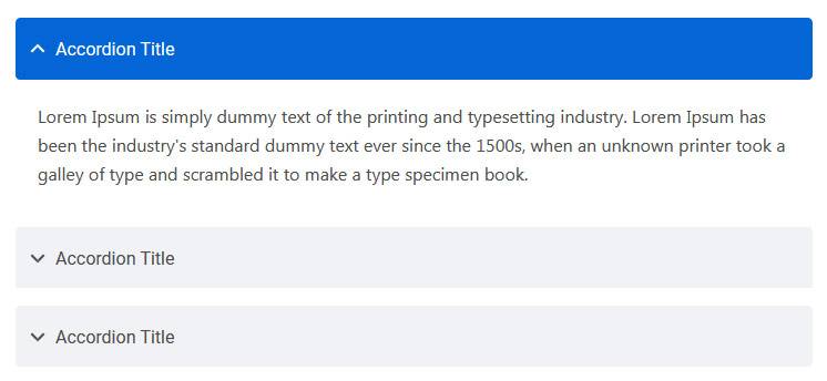
Accordion
You can extend the default collapse behavior to create an accordion. To properly achieve the accordion style, be sure to use .accordion as a wrapper.
See below image and code for more information.
<div class="accordion" id="accordionDefault">
  <div class="card">
    <div class="card-header" id="headingOne">
      <h5 class="mb-0"> <a href="#" data-toggle="collapse" data-target="#collapseOne" aria-expanded="true" aria-controls="collapseOne">Accordion Title</a> </h5>
    </div>
    <div id="collapseOne" class="collapse show" aria-labelledby="headingOne" data-parent="#accordionDefault">
      <div class="card-body">This is Accordion Content</div>
    </div>
  </div>
  <div class="card">
    <div class="card-header" id="headingTwo">
      <h5 class="mb-0"> <a href="#" class="collapsed" data-toggle="collapse" data-target="#collapseTwo" aria-expanded="false" aria-controls="collapseTwo">Accordion Title</a> </h5>
    </div>
    <div id="collapseTwo" class="collapse" aria-labelledby="headingTwo" data-parent="#accordionDefault">
      <div class="card-body">This is Accordion Content</div>
    </div>
  </div>
  <div class="card">
    <div class="card-header" id="headingThree">
      <h5 class="mb-0"> <a href="#" class="collapsed" data-toggle="collapse" data-target="#collapseThree" aria-expanded="false" aria-controls="collapseThree">Accordion Title</a> </h5>
    </div>
    <div id="collapseThree" class="collapse" aria-labelledby="headingThree" data-parent="#accordionDefault">
      <div class="card-body">This is Accordion Content</div>
    </div>
  </div>
</div>
Options:
| Type Class | Features | Code Example |
|---|---|---|
.accordion-alternate |
Alternate Minimal Style for the accordions. | |
.arrow-right |
For set arrow in right side in accordions | |
Tabs
Default Bootstrap Nav component combined with iDocs for unique tabs.
See below image and code for more information.
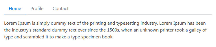
<ul class="nav nav-tabs" id="myTab" role="tablist">
  <li class="nav-item" role="presentation">
    <a class="nav-link active" id="home-tab" data-toggle="tab" href="#home" role="tab" aria-controls="home" aria-selected="true">Home</a>
  </li>
  <li class="nav-item" role="presentation">
    <a class="nav-link" id="profile-tab" data-toggle="tab" href="#profile" role="tab" aria-controls="profile" aria-selected="false">Profile</a>
  </li>
  <li class="nav-item" role="presentation">
    <a class="nav-link" id="contact-tab" data-toggle="tab" href="#contact" role="tab" aria-controls="contact" aria-selected="false">Contact</a>
  </li>
</ul>
<div class="tab-content my-3" id="myTabContent">
  <div class="tab-pane fade show active" id="home" role="tabpanel" aria-labelledby="home-tab">This is Tab Content Home</div>
  <div class="tab-pane fade" id="profile" role="tabpanel" aria-labelledby="profile-tab">This is Tab Content Profile</div>
  <div class="tab-pane fade" id="contact" role="tabpanel" aria-labelledby="contact-tab">This is Tab Content Contact</div>
</div>
Options:
| Type Class | Features | Code Example |
|---|---|---|
Basic Navs |
Basic Navs Style for the Tabs | |
.nav-separator |
Basic Navs Style with Separator for the Tabs | |
.nav-tabs |
Tabs Navs Style for the Tabs. For example - above Preview Example. | |
.nav-pills |
Pills Navs Style for the Tabs | |
Helper Classes
We have created some really useful helper classes for you. Here are a few of them. also, You can refer other default bootstrap helper classes here: Bootstrap Documentation
Text Size:
.text-0- Changes the Font size to 11px..text-1- Changes the Font size to 12px..text-2- Changes the Font size to 14px..text-3- Changes the Font size to 16px..text-4- Changes the Font size to 18px..text-5- Changes the Font size to 21px..text-6- Changes the Font size to 24px..text-7- Changes the Font size to 28px..text-8- Changes the Font size to 32px..text-9- Changes the Font size to 36px..text-10- Changes the Font size to 40px..text-11- Changes the Font size to 44px..text-12- Changes the Font size to 48px..text-13- Changes the Font size to 52px..text-14- Changes the Font size to 56px..text-15- Changes the Font size to 60px..text-16- Changes the Font size to 64px..text-17- Changes the Font size to 72px..text-18- Changes the Font size to 80px..text-19- Changes the Font size to 84px..text-20- Changes the Font size to 92px.
Font Weight:
.font-weight-100- For font weight of 100..font-weight-200- For font weight of 200..font-weight-300- For font weight of 300..font-weight-400- For font weight of 400..font-weight-500- For font weight of 500..font-weight-600- For font weight of 600..font-weight-700- For font weight of 700..font-weight-800- For font weight of 800..font-weight-900- For font weight of 900.
Background Color:
.bg-transparent- For background color of transparent.bg-light- For background color of light gray.bg-light-1- For background color of more light gray.bg-light-2- For background color of more light gray.bg-light-3- For background color of more light gray.bg-light-4- For background color of more light gray.bg-dark- For background color of dark.bg-dark-1- For background color of dark gray.bg-dark-2- For background color of more dark gray.bg-dark-3- For background color of more dark gray.bg-dark-4- For background color of more dark gray
Box Shadow
.shadow-none- For No shadow to elements with box-shadow utilities..shadow-sm- For Small shadow to elements with box-shadow utilities..shadow- For Regular shadow to elements with box-shadow utilities..shadow-md- For medium light shadows to elements with box-shadow utilities..shadow-lg- For Larger shadows to elements with box-shadow utilities.
Opacity
.opacity-1- For 10% opacity..opacity-2- For 20% opacity..opacity-3- For 30% opacity..opacity-4- For 40% opacity..opacity-5- For 50% opacity..opacity-6- For 60% opacity..opacity-7- For 70% opacity..opacity-8- For 80% opacity..opacity-9- For 90% opacity.
Border Radius
.rounded-top-0- No Border Radius for top..rounded-bottom-0- No Border Radius for bottom..rounded-left-0- No Border Radius for left..rounded-right-0- No Border Radius for right.
Borders, Sizing, Spacing (margin & padding) and also much more....
FAQ
A FAQ is a list of frequently asked questions (FAQs) and answers on a particular topic.
Changelog
See what's new added, changed, fixed, improved or updated in the latest versions.
For Future Updates Follow Us @themeforest / @facebook / @twitter / @Dribbble
Version 1.1 (12 Oct, 2020)
- Added Your information here for added new feature
- Fixed Some minor bugs for browser compatibility
- Fixed Some minor bugs for responsive
- Updated FontAwesome to Latest Version
- Updated Bootstrap to Latest Version
- Updated Improvements in CSS and JS
Version 1.0 (8 April, 2020)
Initial Release